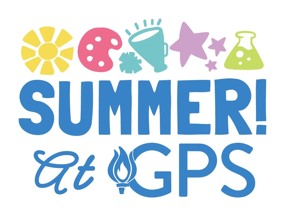
Girls Preparatory School Summer Camp Branding
Problem: Outdated logo (see bottom right) and branding lacking distinction and excitement
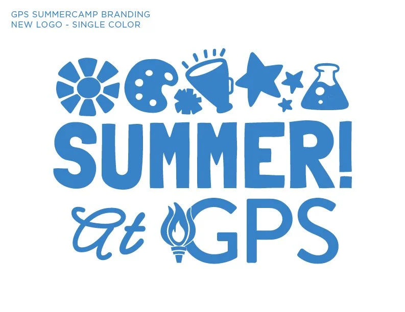
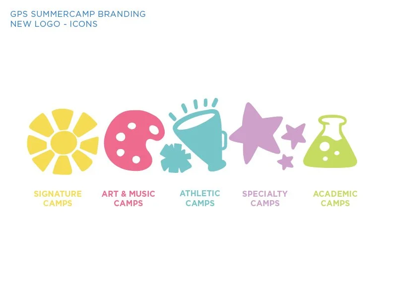
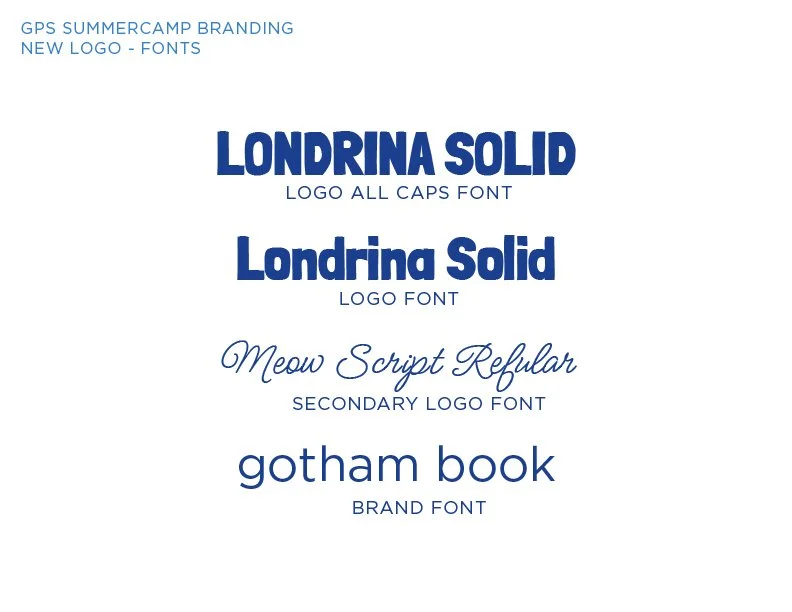
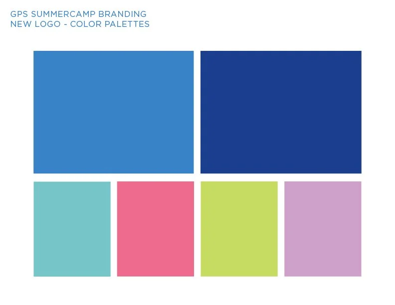
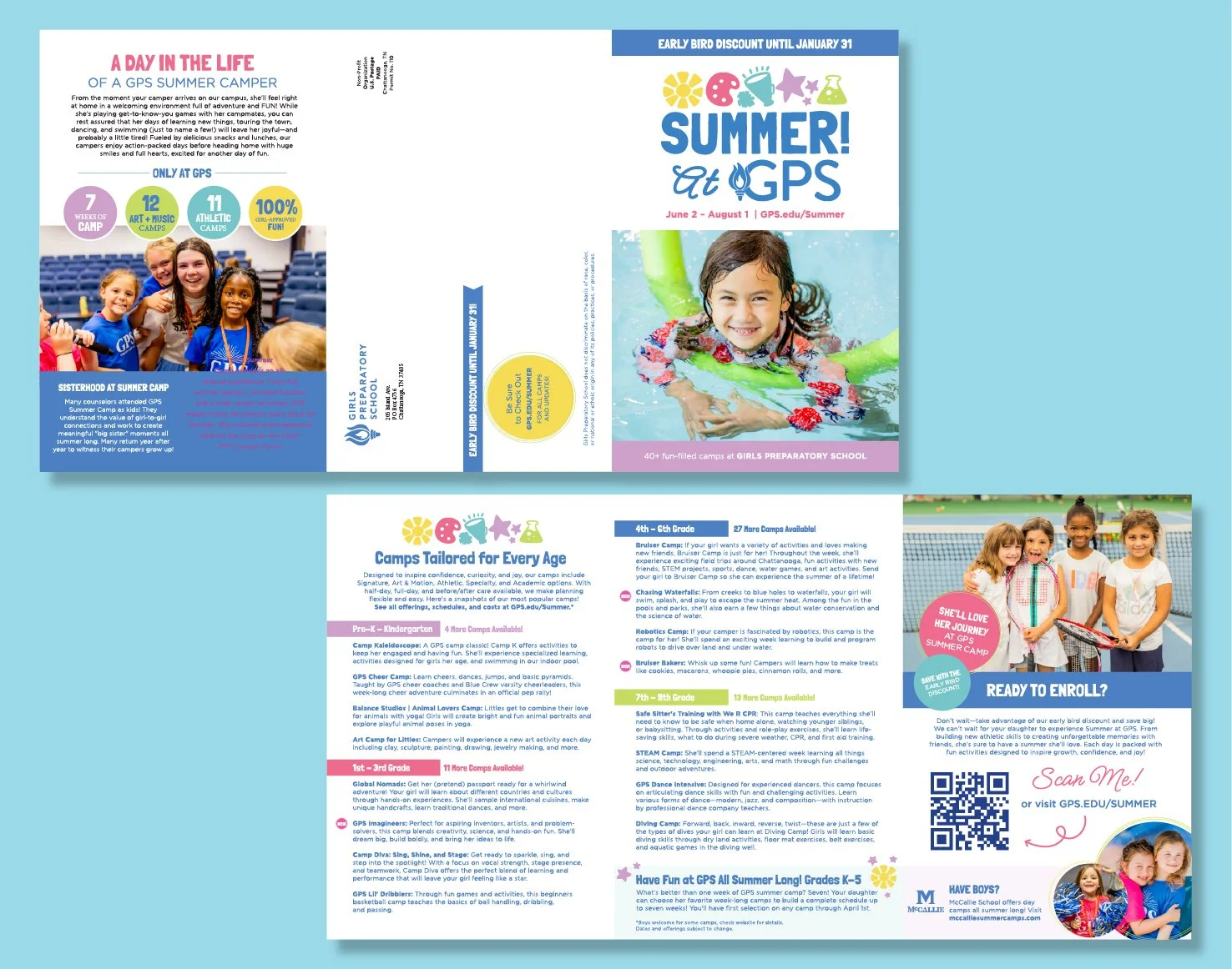
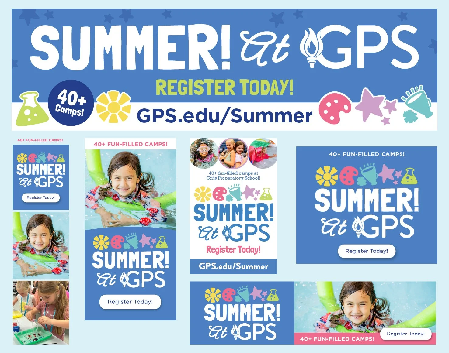
Solution: A memorable, fun, and dynamic logo refresh. The primary text retains the signature “brand blue,” complemented by a brighter secondary color palette to enhance visual appeal and distinguish the program from other school offerings. Custom hand-illustrated icons were created to represent each camp category: signature, arts, athletics, special, and STEM.