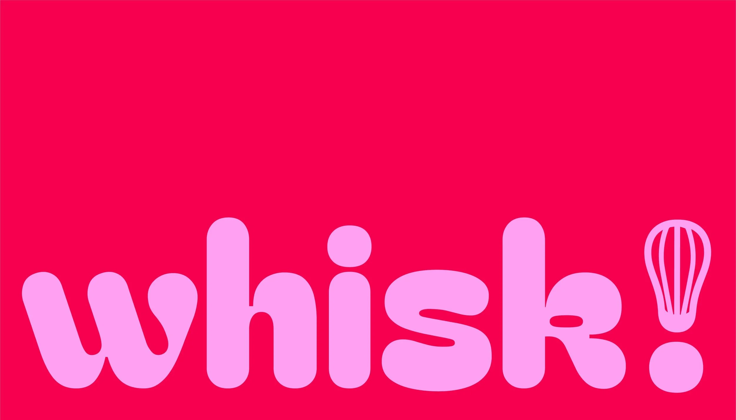
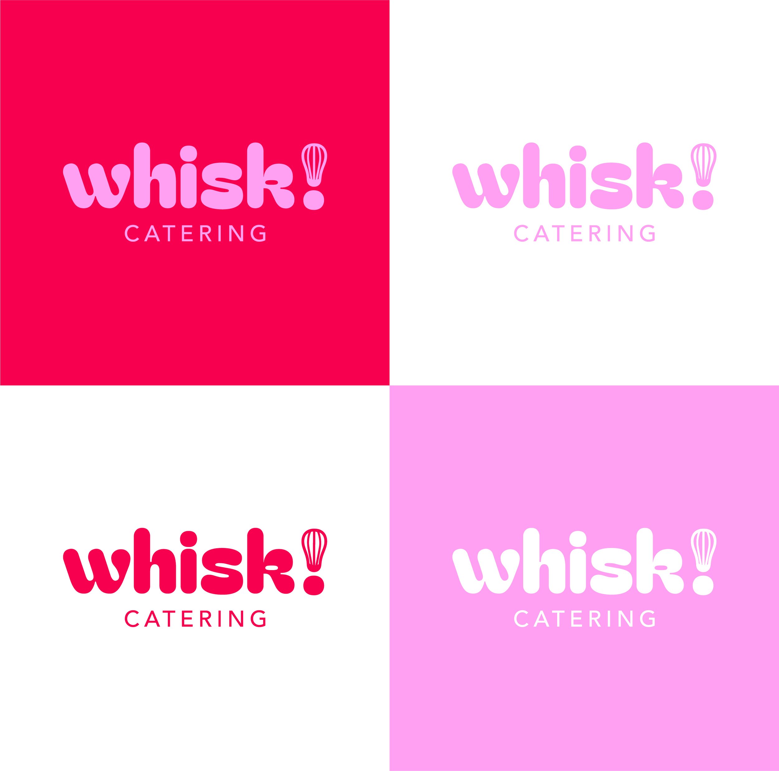
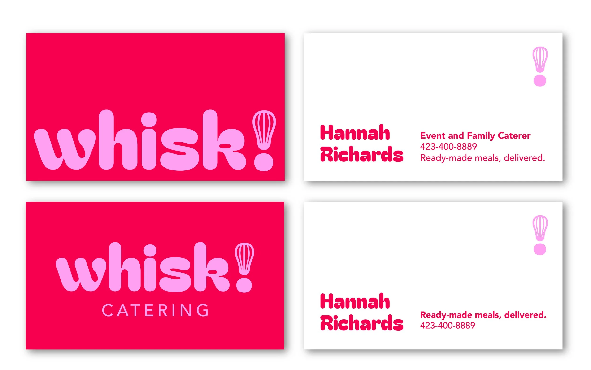
Whisk Catering
Goals: Logo and branding that is “fun, bright, and a little funky.”
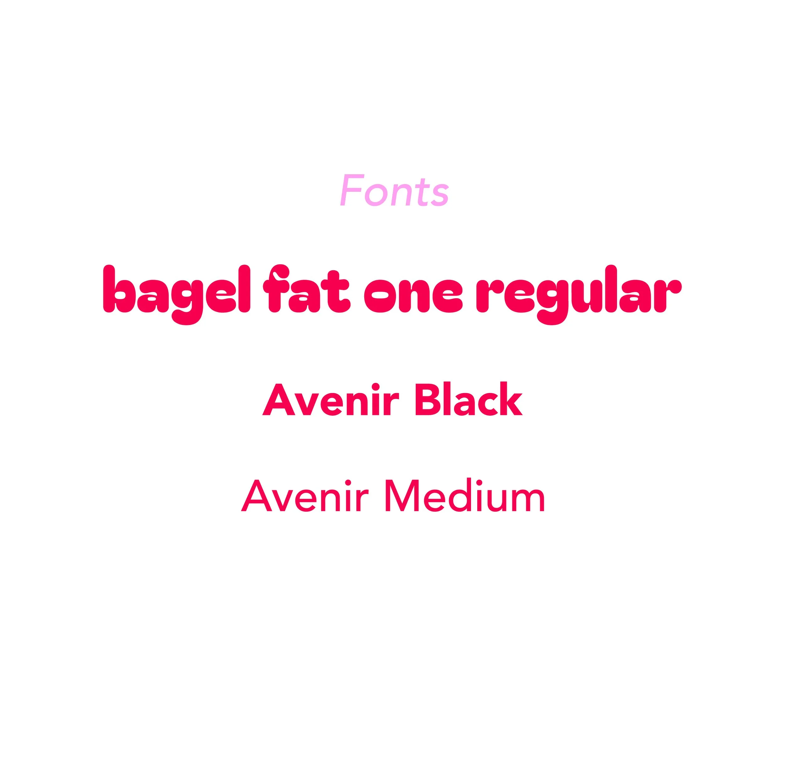
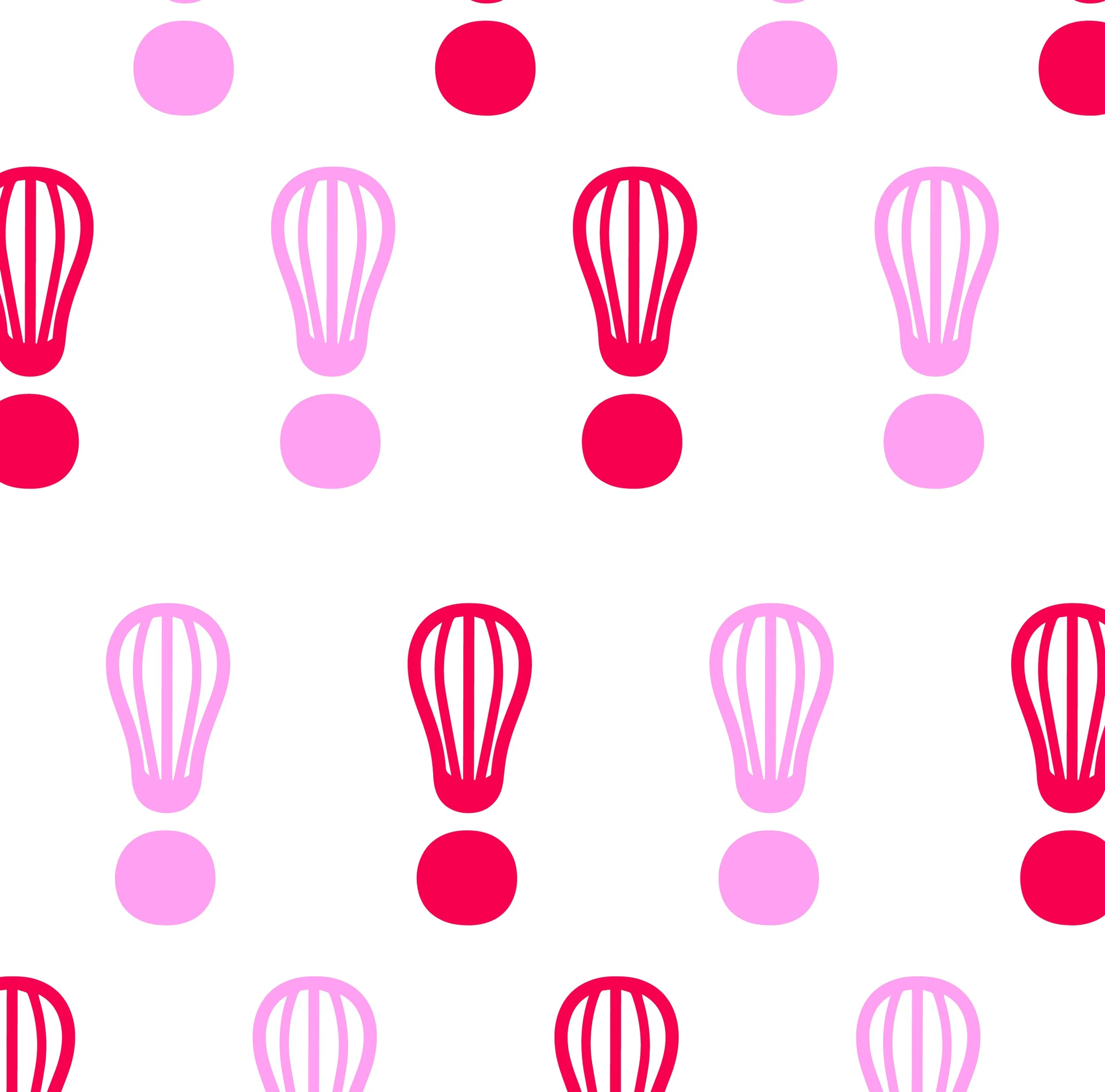
Solution: A clean, slightly funky font that carries the aesthetic of Whisk. Knowing the client loved pink, I incorporated subtle pink hues to reflect her identity within the branding. I also transformed the exclamation point into a whisk to reinforce the concept and introduce a cohesive icon mark.